Eco Friendly or Garden Fonts
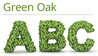
In many cases, choosing a font based mainly on a colour or with too obvious a connection to your subject matter is usually a mistake. However there are some very good examples of green living type sites which do exactly like that. They don’t use these fonts for all their text but on landing pages or specific demonstration pages. They can be quite fun if used properly.

This is very good although I’m not sure how useful it is for everyday text. I did try putting it on a simple blog about lawnmowers – http://www.bestelectriclawnmower.co.uk/, but I have to say the results weren’t too impressive. Put them on signs and presentations though and they can be extremely effective.

Colour is often a better option than using anything too complicated, however it’s important to remember that some colours are better for sales pages. From the above blog, this page was turned green and it’s conversion rate plummeted – the colour green it appears is not a selling colour.
Here’s an example of combining a simply font for headings with something a bit more varied for the content. It could work very well on the right website and with some careful placement.